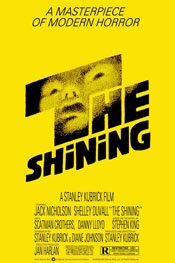
 Directed by Stanley Kubrick
One of the confusions The Shining created when released was the fact there was a novel by Stephen King. People immediately thought it was a movie of the novel. It’s not. King and Stanley Kubrick could not be more opposite to one another.
While the movie uses a similar storyline as the book, and the same character names, the story is not the same. The visions are wildly different.
If King was not happy with the movie (which I’ve read he was not) it’s understandable.
He probably thought he would see his book on screen.
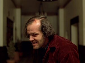
Kubrick’s intent is to show an American family deconstructing and why it deconstructs. This is the real horror of the film, not the ghosts or the axe-wielding madman.

And, as is usually the case with Kubrick, he is clinical about it. It’s a very odd experience to see a supposed horror film, one with blood and bodies, and feel so detached from it. But Kubrick shoots and constructs The Shining almost documentary style.
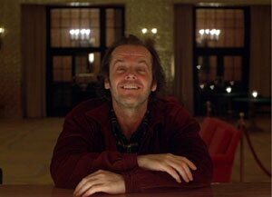
For instance, in an early scene where Jack Nicholson as Jack Torrance is being interviewed for the position of caretaker of the Overlook Hotel, the scene is staged very formally.
The dialogue is largely irrelevant and the interactions a little awkward – quite like a real interview. And the camera tends to remain apart from the scene. There are few if any close-ups. Most of the shots are medium to almost wide shots intended, I think, to emphasise the distance between all the characters and their lack of real communication. It’s all very superficial.
Again, it feels like a documentary, as if you are a voyeur watching the scene through a window on a police interrogation room. You don’t get to know any of the characters here. In this scene, mind you, none but Nicholson’s is very important. But throughout the movie, you don’t ever get to really know, much less connect with any characters – a very Kubrick-like approach.

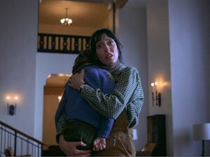
We seldom see the three family members together (mother, father and son). And in one scene where the child, Danny (Danny Lloyd), sits on his father’s knee, although they are physically close the communication between them is all but non-existant, despite the fact they are talking.
Danny seems to lean away from his father, and the father tends to lean or look away from the son when they speak.
(Compare this to what you would likely find in a King novel – every character enunciated, every relationship paid attention to and played with. Not that the characters would have a great deal of depth, but his intent would be to provide something to distinguish each and get you involved with their stories.)
Kubrick’s dispassion and distance begins right from the film’s opening where we see the little yellow car driving through the mountains. It is utterly dwarfed by its surroundings. We see it from a god-like perspective, from afar, from a height.

The emphasis is on how diminutive it is and how impersonal the surroundings, and how imprisoning they are. This sense carries through the entire film.
There are those who complain about the aspect ratio presented on the DVD. The note on the cover reads, “This feature is presented in the full aspect ratio of the original camera negative, as Stanley Kubrick intended.” But why would he want this? Why, when you can take advantage of the breadth a widescreen ratio allows?
I think it’s because Kubrick thinks vertically rather than horizontally. His world is one of height and enclosures, and characters made small by these elements.
I think he intends this ratio because, in many of the scenes in The Shining, it is shot and framed in a way to emphasize how small the characters are and how oppressed they are within their surroundings.
When we see the child Danny riding through the halls, or when we are with the characters in the maze, or when we follow the little car on its way through the labyrinth of the mountains, the emphasis is on how within the world of those scenes the focus (the characters, the car) is dwarfed, oppressed. They are closed in by what surrounds them. How small and ineffectual the characters are is communicated not by breadth but by height, and the way the 1:33 ratio seems to compress the environment.

Compression is a key element in the film. There is a sense of walls closing in, of something approaching; getting closer and closer. Again, the aspect ratio helps communicate this, the mazes as well.
But also notice how the occasional titles are compressed as well: “a month later,” then “Tuesday,” then “8AM.”
Visually, The Shining is a masterpiece. It is completely successful in terms of achieving what Kubrick is trying to do. But in the documentary on the DVD (done by Vivian Kubrick), Jack Nicholson quotes Kubrick saying something to the effect that while something may be real (a performance, say), it isn’t necessarily interesting.
For me, this is the problem with The Shining (as with most Kubrick films). It’s a fascinating, masterful piece of cinema. It’s visually arresting. But … it’s not very interesting as a drama.
I think it’s because the characters are not interesting. They never are in Kubrick films. It’s very hard to like any of them and forge any kind of emotional connection. Kubrick’s characters are chess pieces; they are moved around and say things to help him communicate his ideas on screen. But because they aren’t interesting (and more often than not, simply disagreeable), you just don’t care.
So … The Shining is a brilliant piece of filmmaking. Unfortunately, it’s a very dull story.


